
What Is Ghibli Art? Secrets to Recreating the Aesthetic (2026)
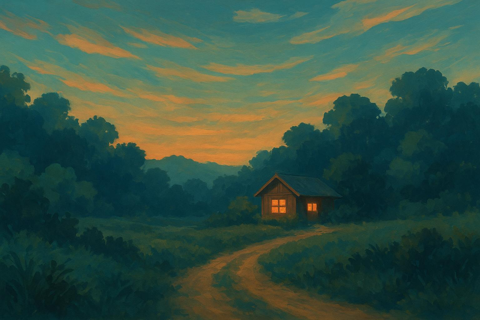
Ghibli art is the recognizable visual language of Studio Ghibli's hand-drawn animation. It features economical linework, detailed watercolor-like environments, atmospheric lighting, and quiet, contemplative pauses. Grounded in real-world observation, it turns natural settings into co-protagonists, allowing the magical elements to feel plausible and deeply emotional.
Color sits at the heart of this look. The Ghibli Museum explains that color brings reality to imaginary worlds by expressing time, weather, and mood, a philosophy showcased in its exhibit on color design by Michiyo Yasuda. This framing of color's role is documented in Painting the Colors of Our Films (Ghibli Museum exhibit page).
Ghibli's craftsmanship ethos is rooted in traditional hand-drawn animation. The British Film Institute notes that the studio was founded to protect drawing-led craft and sincere storytelling, anchoring a visual identity centering on human touch (BFI feature on anime's craft and history).
See Ghibli Style Transformation Live
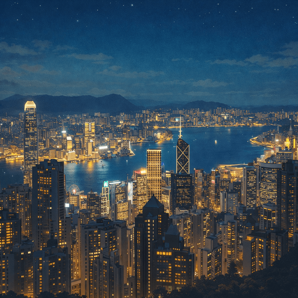
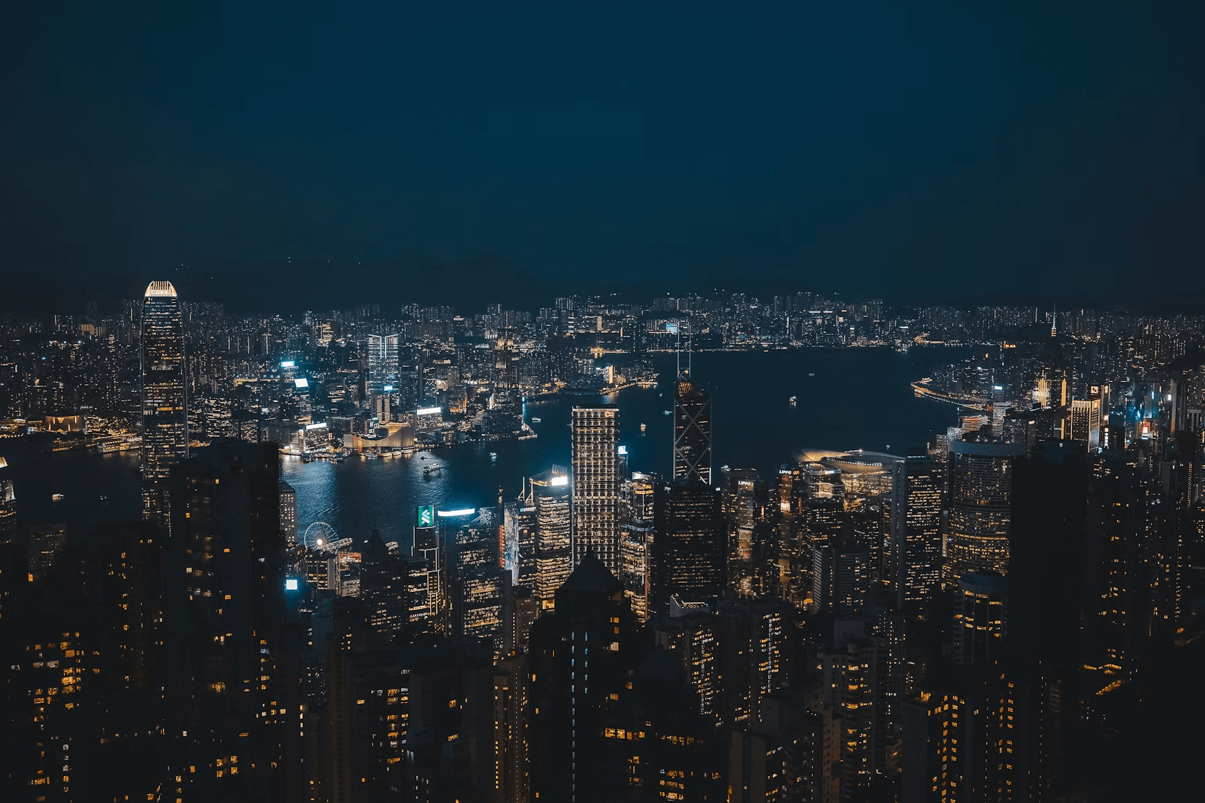
Use the slider below to compare original reference photos with Ghibli-inspired art styles. Select a tab to see different subjects transformed by our algorithm.
What Is Ghibli Art Style?
The aesthetic combines traditional cel animation techniques with deep, layered environmental paintings. Rather than relying on hyper-detailed character models, the studio focuses on expressive movement and emotional resonance. This approach elevates the natural world into a co-protagonist, creating the nostalgic, immersive atmosphere that defines films like My Neighbor Totoro and Spirited Away.
Is Ghibli Art Style Only Hand-Drawn?
This digital evolution allows creators to study color design constraints and atmospheric depth without traditional cel setups. Under the guidance of color designer Michiyo Yasuda, the studio historically painted cels with a limited palette to achieve rich, organic vitality. Modern digital workflows and responsible AI generative scaffolding now make these classical design principles accessible for training, prototyping, and reference study.
Many creators use structured reference workflows to study Ghibli visual grammar and experiment with generative tools. Learn more about how Ghibli Art AI works and how these systems interpret atmospheric depth and palette logic to support artistic training.
What Is the Visual Grammar of Ghibli Art?
Before we break down these techniques, a quick note: key terms are defined within the sections below so newcomers can follow along easily. For broader context on how Ghibli's visual approach sits within the larger anime genre, you can also read about the Ghibli Style vs Anime Art differences.
Linework and Drawing Character
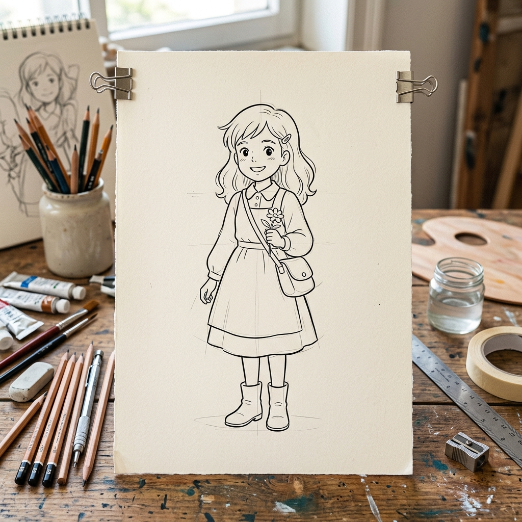
Across many Ghibli films, character lines are clean and economical. Outlines do the heavy lifting, interior marks stay minimal, and motion reads through pose and timing rather than hatch-heavy detailing. This economy keeps silhouettes readable at a glance. By contrast, The Tale of the Princess Kaguya embraces expressive, brush-like line and wash, purposefully allowing lines to breathe and edges to break for energy. These two poles (crisp economy versus intentional roughness) both serve clarity and feeling; they simply route through different mark-making logics. For practice, aim for confident, single-stroke lines on characters, then reserve more broken, textural edges for environments.
Color and Lighting
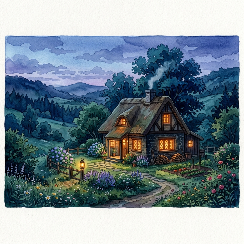
Color in Ghibli art is designed for story clarity and believability. Two technical pillars translate well into practice. First, organize the scene into three dominant brightness zones (light, mid, dark) so it reads even in grayscale (value grouping). Second, use warm-cool moves to suggest time of day, such as a warm sky against cool shadows at golden hour, or cooler ambient tones on overcast days (temperature shifts). Together, value hierarchy and temperature cues make environments feel grounded without over-detail.
Textures and Materials
Backgrounds feel tactile: leafy masses read as shapes first, then resolve into soft texture; water surfaces show gentle hue and value transitions; wood, stone, and earth carry subtle brush variation. Background painters such as Kazuo Oga use a gouache look (opaque layers, soft edges, and controlled, naturalistic chroma) to depict environments. The Museum of Contemporary Art Tokyo has documented Oga's work and its impact on backgrounds (MOT exhibition page). A pragmatic takeaway: mass big shapes first, then add restrained detail. Let brush texture imply material rather than outlining every leaf.
Background Methods and Depth
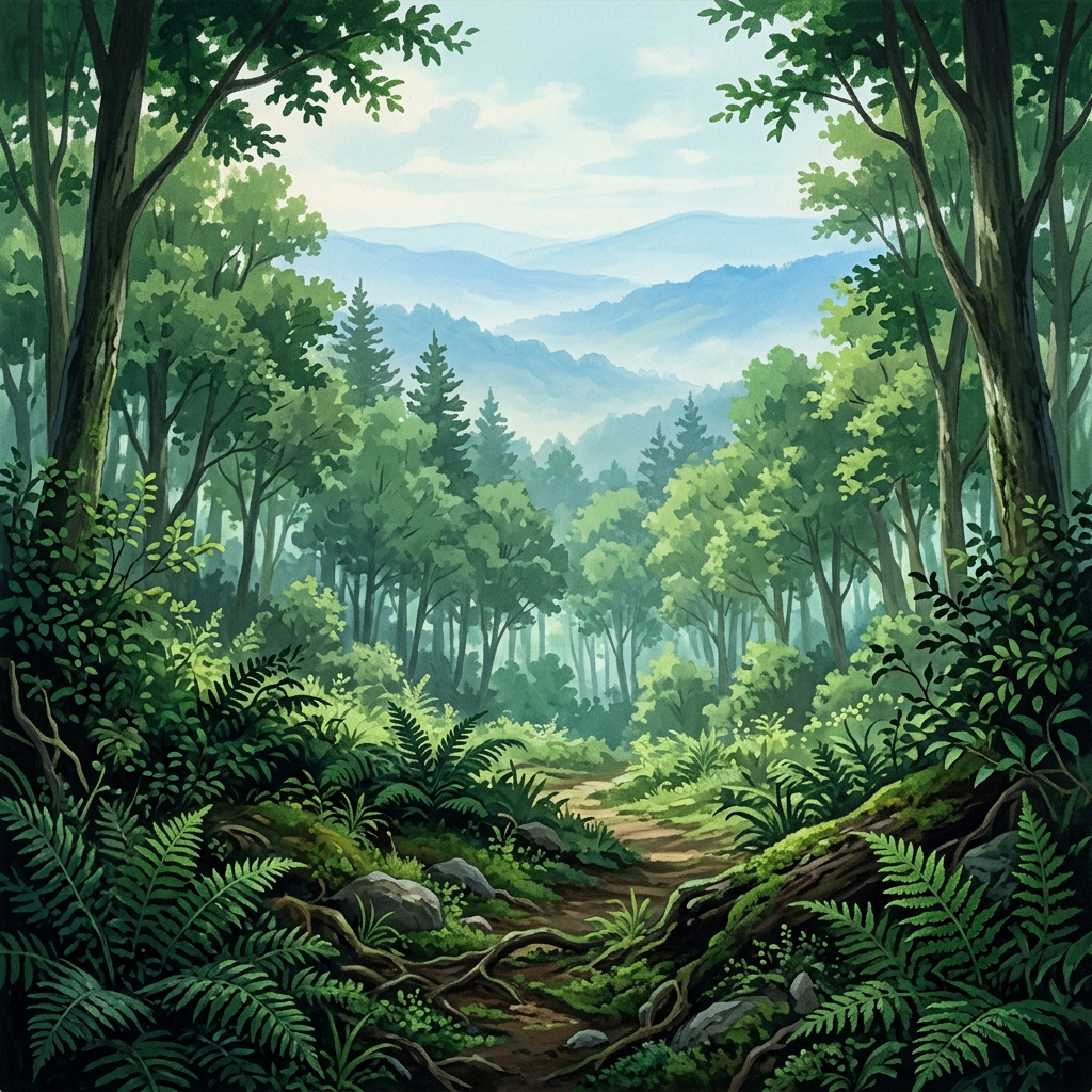
Most Ghibli environments establish depth with a readable three-plane strategy: a darker, slightly more detailed foreground; a simplified midground; and a lighter, hazier background. That haze represents atmospheric perspective, where distant objects appear lower in contrast and slightly cooler or lighter due to particles in the air. This three-plane structure keeps the viewer's eye moving comfortably and supports composition clarity. To keep depth convincing, taper detail density as forms recede and avoid equal contrast everywhere. Think of it as stage lighting for paint, where contrast peaks near your main subject.
Composition and Camera Language
The studio's cinematic rhythm favors gentle pans, carefully framed holds, and moments of quiet. Director Hayao Miyazaki calls these intervals \"ma\" (intentional pauses that let emotion breathe). He explains the concept as the meaningful \"emptiness\" between actions, arguing that without these beats, scenes become mere busyness (Ebert interview with Miyazaki on \"ma\"). Visually, that means compositions that honor negative space and place human figures within a broader environment. The camera often steps back to let nature lead.
Character Design Cues
Characters tend to read as approachable and rounded, with clear silhouettes and understated costuming that speaks to everyday life. Eyes and facial proportions are designed for emotional legibility, while clothing textures remain simplified so they harmonize with painterly backgrounds. The net effect is a calm interface between line-driven characters and brush-driven worlds. This keeps the emotional focus on the characters' acting and expressions, preventing complex designs from distracting the audience from the core narrative.
What Can We Learn from Film-Anchored Mini Studies?
Let's examine how these design components show up in Studio Ghibli's classic catalog:
- My Neighbor Totoro (1988): Twilight scenes balance a warm interior window glow against cool, humid evening air. The value grouping keeps the cottage readable: the sky sits in a light group, foliage in mid, and the path/foreground accents in dark. Try a color study using five swatches (key light, ambient mid, core shadow, accent, and neutral) to practice restraint.
- Spirited Away (2001): The bathhouse complex shows nuanced material rendering (tile, wood, steam) while character animation remains pencil-driven. Miyazaki has noted the film is pencil-drawn, with selective digital effects for things like wave patterns. Isolate steam layers with soft edges over a stable midtone structure to replicate this effect.
- Princess Mononoke (1997): Forest shots demonstrate layered depth: darker, detailed foreground fronds; simplified mid trees; cool, hazy distance. Build the scene in three passes (foreground massing, mid simplification, background haze) and test legibility at small sizes.
- The Tale of the Princess Kaguya (2013): Lines become lively and sketch-forward, while washes feel like watercolor. Use variable-width strokes and let edges break into the paper. Keep color economical so line remains the star.
How Do You Study and Replicate the Ghibli Look Responsibly?
Follow this structured training workflow to study and replicate the signature look:
- Palette extraction: Grab a reference frame and sample five swatches (key light, ambient mid, core shadow, accent, and a neutral). Paint a study using only those five to internalize the limited-palette logic.
- Value mapping: Convert your reference to grayscale and block the scene into three value groups. Ensure the layout remains readable at thumbnail size.
- Three-plane depth: Build foreground (dark/detail), midground (simplified), and background (light/hazy) in sequence. Reduce detail as you recede.
- Edge control: Practice hard edges for focal objects and soft or lost-and-found edges for atmosphere. Use dry-brush strokes for sketchy vitality.
- Shot-study for ma: Storyboard three panels capturing setup, pause, and release. Mark the moments of stillness and color temperature shifts.
- Material emulation: Lay a flat base tone, mass shadow families, then add highlights. Build digital brush presets that accumulate opacity with a slight paper tooth.
What Are the Historical Influences Behind Ghibli Art?
The Ghibli look echoes traditional Japanese pictorial traditions. You will see hints of sumi-e (ink painting) in the valuing of negative space and brush cadence; emaki (picture scrolls) in lateral movement and episodic staging; and ukiyo-e in clear shapes and color separations. European illustration and background-painting lineages also filter in through travel, art books, and studio exchanges. Sincerity and human touch guide the aesthetic, protecting hand-drawn discipline over sheer spectacle.
How to Balance Ghibli Style Inspiration vs Copying?
Study Ghibli frames for learning, and keep your studies private unless they fall under fair-use commentary. Use insights (value grouping, palette restraint, and edge hierarchy) to create original art rather than derivative replicas. Always credit your visual influences when sharing work online, and avoid commercializing studies of copyrighted characters or frames. Developing your own voice while honoring the craft is the ultimate respect. This ethical approach ensures you contribute originally to the artistic community while learning from historical masters.
Think of Ghibli art as a conversation between line, light, and lived-in places. If you are an aspiring animator, try the value map and three-plane depth exercises first. If you are a film lover, watch for "ma" and how color temperature shifts cue mood. Educators can adapt the palette and shot-study drills into rubrics. And for everyone: the next time a scene holds on a quiet evening path, notice how a few carefully chosen values and hues make the world feel real, then try painting that feeling yourself.